Video Production
I've designed a LOT of billboards. First, the university I used to work for loved to put up dozens of billboards, which worked well for their marting purposes. Additionally, a buddy of mine owns billboards, and I've been his go-to designer for nearly 30 years.
Billboard advertising uses a large-scale print advertisement for marketing a company, brand, product, service, or campaign. Billboards are typically placed in high-traffic areas, such as highways and cities, so the highest number of drivers and pedestrians see them. Because they’re in such busy areas, billboards tend to have many views compared to other marketing methods.
When thinking about your design, we need to keep it simple and bold. A passerby only has a few seconds to glimpse your billboard advertisement. To reach the highest number of viewers, keep your billboard design simple. After all, some people may be driving by your billboard at 70 mph. Use bold fonts against contrasting background colors and avoid narrow script fonts. Also, choose colors that stand out to viewers. Avoid greens, blues, and browns if your billboard is in a rural area. I try to get my clients to keep the main message to 4 words, which sometimes seems impossible to them. Looking at my portfolio, you'll see a billboard I did for Purdue University, "Enroll for Fall Today!" I wanted "Enroll for Fall," but I lost that argument.
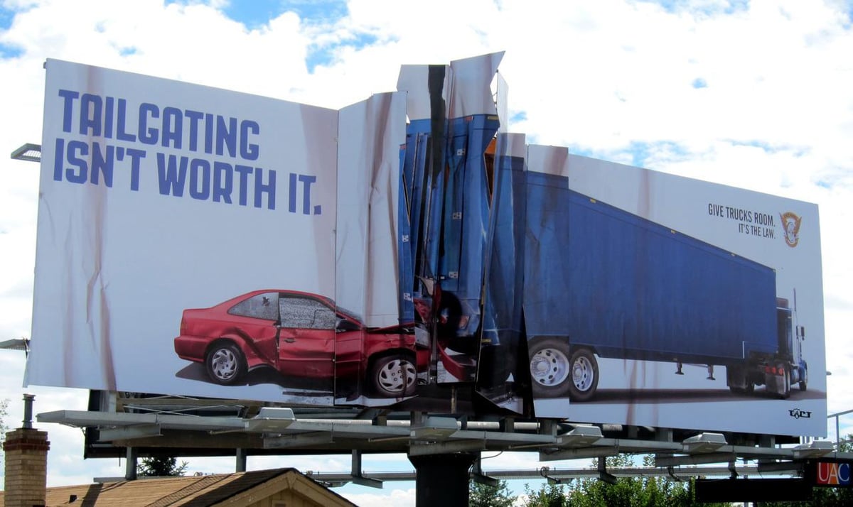
That "thing" in the Purdue billboard is a photo and a sculpture that used to sit at the entrance to the campus on a major highway. Anyone from that area has seen it, which brings me to my final point. Make it memorable! Put some serious energy into the creative. Make the viewer remember your billboard.
I didn't design this, but it's terrific. It's also fitting since I live in Polk County, Florida, the tailgating capital of the world!
